White, Beige & Neutrals — How to Use Them Without Boring Walls
- The Curated Living
- Apr 26
- 5 min read

Updated: May 15
There is a reason neutral homes never go out of style.
Walk into a beautifully done neutral space and you feel it immediately — calm, expansive, refined. Nothing is fighting for your attention. Everything breathes. The room feels curated rather than decorated.
And yet most neutral homes miss the mark entirely. They end up feeling flat, cold, characterless. The walls look unwashed. The furniture disappears. The whole space feels like it is waiting for something to happen.
The difference between a neutral home that feels luxurious and one that feels lifeless comes down to one thing — how well you understand the language of neutrals. This blog is going to teach you exactly that.
First — What Actually Is a Neutral?
Most people think neutrals mean white, beige and grey. But the neutral family is far richer than that.
True neutrals include warm white, off-white, cream, parchment, linen, sand, stone, taupe, warm grey, greige, clay and natural wood tones. The key word in all of these is warm. Warm neutrals feel alive and intentional. Cold neutrals — the blue-whites, the stark greys — feel clinical and flat.
The single most important decision in a neutral home is choosing neutrals with a warm undertone. Everything else flows from that.
The Secret to Neutrals That Never Look Boring
Texture.
This is the answer. A room done entirely in warm white — but with a boucle armchair, a linen sofa, a jute rug, a wooden side table and a ceramic vase — feels endlessly rich and interesting. The same room in smooth paint, synthetic fabric and plastic finishes looks like a waiting room.
Neutrals are a canvas. Texture is the art.
When you layer different textures within the same tonal family, the eye has something to travel across. Light catches differently on linen versus boucle versus wood versus ceramic. The room breathes and shifts throughout the day as light changes.
This is the architect's secret to a neutral home that feels like it cost far more than it did.
Warm White — The Most Misunderstood Neutral
White is the most commonly chosen wall colour and the most commonly regretted one.
The reason? Most people choose a white that is too cold, too stark or too blue. It looks fine on the paint chip and feels harsh on the wall. By the time the furniture is in and the lighting is on, the room looks like a showroom — not a home.
The solution is to always choose a white with a warm undertone. Look for whites described as ivory, cream, parchment, linen white or warm white. Test them on your wall at A3 size and observe them under both natural and artificial light.
A warm white wall does something remarkable — it makes every other element in the room look better. Timber glows against it. Plants look lush. Art pops. Soft furnishings feel intentional.
Beige Is Back — And It Never Really Left
Beige had a bad decade. It became synonymous with the safe, the bland, the builder-grade. But the beige of 2026 is a completely different proposition.
Modern beige is warm, architectural and deeply sophisticated. Think less magnolia rental flat and more Parisian apartment — warm stone walls, honey-coloured oak floors, linen curtains pooling on the floor.
The key is choosing a beige with depth. A flat, chalky beige reads as tired. A beige with golden or clay undertones reads as intentional and luxurious. Pair it with natural materials and warm lighting and the transformation is remarkable.

The Neutral Entryway — Where First Impressions Live
Your entryway is the first thing you and everyone who visits your home experiences. It sets the emotional tone for everything that follows.
A neutral entryway done well — warm cream walls, a rattan or wooden mirror, a console table with a ceramic bowl, dried botanicals in a tall vase, a jute runner — communicates something instantly. It says this home is curated, calm and considered.
It is also one of the easiest places to commit to a neutral palette because the space is usually small. A beautiful neutral entryway costs very little to achieve and delivers an enormous amount of visual impact.
Room by Room — Neutrals Done Right
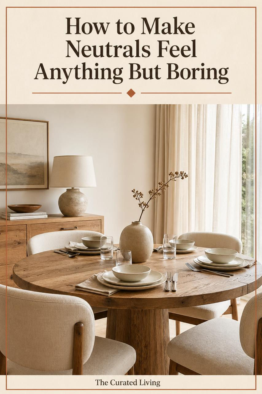
Living Room: Build your neutral living room around one anchor piece — a boucle or linen sofa in cream or warm sand. Add a jute or wool rug, a wooden coffee table, ceramic vessels and dried botanicals. Layer throw cushions in slightly different neutral tones — ivory, linen, warm grey. The result is a room that feels effortlessly complete.
Bedroom: The neutral bedroom is the easiest to get right. Warm white or cream walls, linen bedding in off-white or warm sand, wooden bedside tables, a ceramic lamp and a single plant. Keep it simple, keep it warm, keep it textured. This is the bedroom that photographs beautifully and sleeps even better.
Kitchen: Warm white upper cabinets with natural wood countertops and stone or terracotta tile details. This combination never dates and works in every size of kitchen. Add brass or aged bronze hardware for warmth and character.
Bathroom: Stone, warm white and natural wood create a spa-like bathroom that feels deeply restorative. Terrazzo flooring in warm cream tones, linen towels, a wooden stool, a ceramic soap dish — these are the details that elevate a neutral bathroom from basic to beautiful.

The Colours That Pair Beautifully With Neutrals
Neutrals are not meant to exist in isolation. They are a backdrop — and the right accent colours bring them to life without overwhelming them.
Terracotta: is the perfect accent for a warm neutral home. A terracotta pot, a terracotta tile detail, a single terracotta cushion — it adds warmth and earthiness without competing.
Sage Green: brings life and freshness to a neutral palette. Plants alone will do this, but a sage green cushion or throw against a cream sofa is particularly beautiful.
Warm Black or Charcoal: adds grounding and definition. A charcoal lamp, a dark framed mirror, black hardware — these details stop a neutral room from floating away into blandness.
Natural Wood: is not just a material — it is a colour. The honey and amber tones of natural oak or walnut bring the single most important warmth to any neutral space.

The One Rule for Every Neutral Home
Commit to warmth and never deviate from it.
Every single element in your neutral home — every wall colour, every fabric, every material, every light fitting — should have a warm undertone. The moment a cool-toned element enters the space, the whole palette loses its coherence.
Warm white walls. Warm grey rug. Warm wood tones. Warm brass or bronze hardware. Warm linen and boucle fabrics. Warm ceramic and stone accessories.
When everything pulls in the same warm direction, the result is a home that feels completely of a piece — cohesive, intentional, deeply beautiful.
Your Next Step
Ready to bring colour into your home with confidence?
Start here — it's free: 👉 Download the Free Colour Starter Guide
Take it further: 👉 Colour Your Space Workbook — ₹199 for Indian buyers
👉 Colour & Your Home: The Complete Guide — ₹449 for Indian buyers


Comments