Vastu Colours by Room: Ancient Wisdom for the Modern Home
- The Curated Living
- May 2
- 4 min read

Updated: May 15

Colour in the home has never been arbitrary — not in any culture, and not in any era.
Vastu Shastra, the ancient Indian science of space and design, has been prescribing specific colours for specific rooms for thousands of years. Like Feng Shui in Chinese design philosophy, Vastu approaches the home as a living system — one where direction, light, elemental energy, and human wellbeing are deeply interconnected.
And here is what makes it genuinely fascinating: the Vastu colour recommendations for each room align, with remarkable consistency, with what modern design science and architectural practice would independently arrive at. This is not coincidence. Ancient builders were acute observers of how light, space, and human behaviour interact. Their colour prescriptions were, in many ways, an early form of evidence-based design.
Whether you follow Vastu as a philosophy or simply appreciate it as a framework, the colour logic it offers for each room is worth understanding. Here is how to apply it in any home, anywhere in the world.
What Vastu Says About Colour — And Why It Works
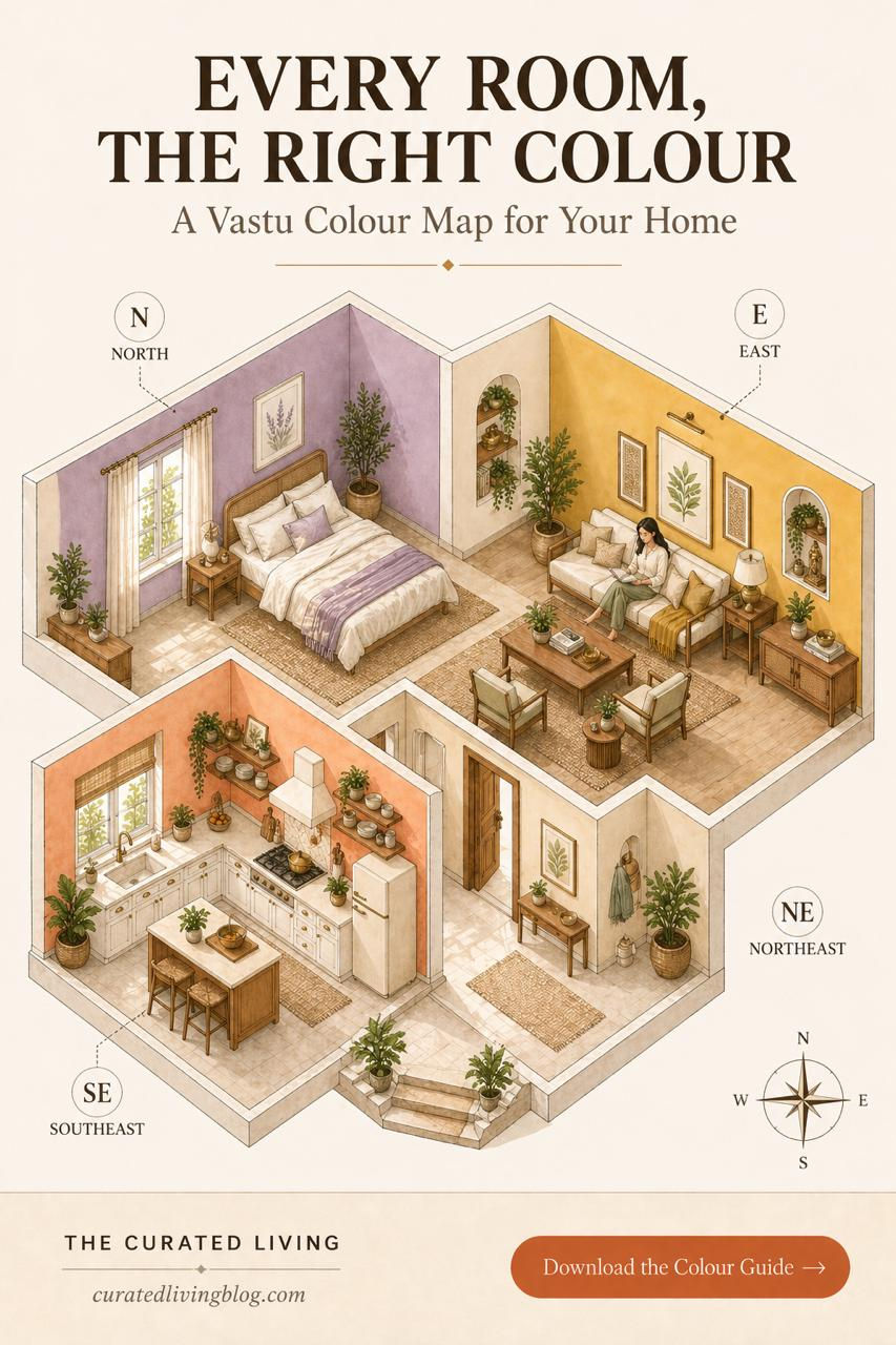
Vastu divides the home into zones based on the eight cardinal and intercardinal directions. Each direction is governed by a planet, an element, and an energy — and each responds best to certain colours.
What most people miss is that these colour recommendations correlate remarkably well with the quality of natural light that enters from each direction. North-facing rooms receive cool, diffused light. East-facing rooms receive fresh morning light. Southeast rooms receive direct, warm morning sun. This relationship between direction and light quality is at the heart of why Vastu colour logic works — and why it translates across climates and geographies.
The Living Room — North or East Facing
Vastu recommends warm yellows, greens, and white for living rooms, particularly those facing north or east.
North-facing rooms receive cool, consistent, diffused light throughout the day — the kind of light that makes warm yellows and mustard tones absolutely glow. These colours feel energising without being overwhelming, welcoming without being loud.
From a design perspective, warm yellows in a north or east-facing living room create exactly the energy the space needs — compensating for the cooler quality of northern light and making the room feel alive and inhabited.
Architect's recommendation: Warm mustard or golden yellow on one feature wall, warm white on remaining walls and ceiling. Brass and wood accents to reinforce the warmth.
The Bedroom — South or West Facing
For bedrooms, Vastu recommends soft blues, lavender, pink, and cream — colours that calm the nervous system and support rest.
This is where Vastu and neuroscience agree completely. Cool, muted colours lower cortisol levels and support the body's transition into sleep. A south or west-facing bedroom receives warm, direct afternoon and evening light — and a cool lavender or soft blue wall beautifully balances that warmth without fighting it.
Architect's recommendation: Soft lavender or dusty blue as the primary wall colour, warm white ceiling, natural linen and warm wood as textural counterpoints. Avoid sharp whites — they feel clinical in a rest space.

The Kitchen — Southeast
The southeast is the zone of Agni — fire — and Vastu recommends warm oranges, peach, and red tones for this direction.
The kitchen is inherently a fire space — it generates heat, activity, and energy. Warm peach and apricot walls honour this energy while keeping the space feeling fresh and inviting rather than aggressive. They also respond beautifully to the warm morning light that typically enters from the southeast.
Architect's recommendation: Warm peach or apricot on the walls, white cabinets, brass hardware. This combination is Vastu-appropriate and also one of the most timelessly beautiful kitchen palettes in contemporary design.

The Entrance — Northeast
The northeast is considered the most auspicious direction in Vastu — the zone of light, clarity, and new beginnings. The colour prescription here is white, cream, and very light yellow.
This makes complete design sense regardless of your relationship with Vastu philosophy. Your entrance sets the tone for your entire home. A light, clean, uncluttered entrance in white or cream feels welcoming, spacious, and calm — exactly the energy you want to greet you and your guests at the door.
Architect's recommendation: Soft white or warm cream walls, natural light maximised, a single statement plant or mirror to amplify the sense of arrival.
A Note on Undertones
Whatever Vastu-inspired colour you choose, always pay close attention to undertone. A lavender with too much blue will feel cold. A yellow with too much green will feel sickly. A peach with too much pink will feel dated.
The undertone of your chosen colour must work with your flooring, natural light, and furniture. This is where most colour advice — Vastu or otherwise — falls short. It gives you the colour family but not the specific shade. Getting the undertone right makes all the difference between a room that feels intentional and one that feels slightly off.
Putting It All Together
A Vastu-aligned home is not a home painted in loud, clashing colours in every room. Done well, it is a home where each space has its own colour personality — calm in the bedroom, warm and welcoming in the living room, energised in the kitchen, clear and light at the entrance.
Moving through such a home feels like a natural transition between different qualities of energy. This is what good architecture does. And it happens to be what good Vastu does too.
Ready to Choose the Right Colour for Your Home?
Choosing colour for a small room is not guesswork — it is a decision that deserves the same care as any other design choice in your home.
My guide Colour & Your Home walks you through exactly how to choose wall colours for every room, how to read undertones, how to work with light, and how to build a colour palette that works across your entire home.
Start here — it's free: 👉 Download the Free Colour Starter Guide
Take it further: 👉 Colour Your Space Workbook — ₹199 for Indian buyers
👉 Colour & Your Home: The Complete Guide — ₹449 for Indian buyers


Comments