Bedroom Design for Sleep — Why It Starts With the Floor Plan, Not the Mattress

We spend a third of our lives in one room. And yet the bedroom is usually the last room anyone designs — furnished with leftovers, arranged around whatever wall the bed happened to fit against, lit by a single ceiling bulb the builder chose.
Here's what most people don't realise: bedroom design for sleep isn't about the mattress, the blackout curtains, or the pillow spray. Those help. But the room itself — the floor plan, the bed position, the light placement, the materials — is doing quiet work on your nervous system every single night, long before your head touches the pillow.
After 12 years of designing residential spaces, I can tell you the bedrooms people sleep best in share the same spatial decisions. None of them are expensive. All of them are learnable.

Why the Floor Plan Comes Before Everything Else
Sleep is a nervous system event. Your body will not fully release into rest unless it reads the environment as safe, settled, and predictable — and it reads the environment spatially, below the level of conscious thought.
This is why you can sleep badly in a beautiful room and deeply in a plain one. The decor isn't what your nervous system is scanning. It's scanning position, exposure, symmetry, and light. Those four things are decided by the floor plan — which means bedroom design for sleep starts with where things sit, not what they look like.
Bed Placement — The Decision That Outweighs All Others
If you change only one thing in your bedroom, change this.
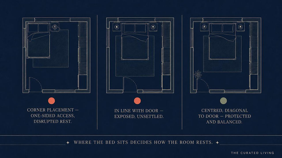
The bed should be centred on a solid wall, positioned so the door is visible from the bed — but never directly in line with it. This is not superstition; nearly every spatial tradition, from Vastu to feng shui to contemporary environmental psychology, converges on the same placement for the same underlying reason. A sleeping position from which you can see the entry, without being exposed to it, is one your body reads as protected.
Three placements to understand:
The corner bed — pushed against two walls — feels space-efficient, but it creates one-sided access, makes the bed harder to make and harder to share, and visually reads as temporary. It's the placement of a hostel, not a home.
The bed in line with the door — where the entry sightline runs straight up the mattress — is the most common placement in Indian apartments simply because of how builder floor plans fall. It's also the most unsettling. Your body registers the direct exposure every night, even if your mind never does.
The centred bed, diagonal to the door — with clearance on three sides — is the placement architects fight to achieve in every bedroom layout. Balanced, protected, accessible from both sides.
The clearance number to remember: 0.75m minimum on three sides of the bed. Enough to walk, make the bed, and — critically — enough for the room to read as composed rather than crammed.
Symmetry — Why Matching Bedside Tables Actually Matter
Symmetry in a bedroom is not a styling preference. It's a signal.
A bed flanked by two matching bedside tables and two matching lamps creates bilateral symmetry — the same visual structure your brain finds in faces, in classical architecture, in every environment it's evolved to read as ordered and safe. An asymmetric bed arrangement — one table, one lamp, one side pushed to a wall — reads as incomplete, and incompleteness is quietly stimulating. It keeps a small part of your attention awake.
This is one of the cheapest fixes in all of bedroom design for sleep. Two matching tables. Two matching lamps. The room settles almost immediately.
Lighting — The Layer That Decides Your Wind-Down
Most bedrooms have exactly one light source: a ceiling fixture, usually centred, usually cool-toned, usually operated by a switch at the door. It is the single worst lighting arrangement for sleep that it is possible to design.
Overhead light after dark mimics midday sun. It tells your circadian system that the day is still going, suppresses the natural rise of melatonin, and turns your last hour before bed into a low-grade argument between your body and your light switch.
The architect's bedroom lighting rule: light low, warm, and layered.
Two bedside lamps with shades sitting roughly 0.60m above the mattress — this keeps the light source below your eye line when you're lying down, so the light pools rather than glares. If you read in bed, add a wall-mounted reading light at roughly 1.00m above the mattress, angled at the page rather than pointing down from overhead. And after dark, the ceiling light simply doesn't get switched on. It exists for cleaning, packing, and finding lost earrings — not for evenings.

Materials — Why Your Bedroom Should Absorb Light, Not Reflect It
Here is a material principle that almost never appears in bedroom content: gloss is stimulation.
Reflective surfaces — high-gloss wardrobes, lacquered furniture, large unframed mirrors facing the bed, glass everywhere — bounce every stray photon around the room. At night, with even a small amount of ambient light from a window or a charging phone, a glossy bedroom shimmers. A matte bedroom goes quiet.
The architect's material rule for bedrooms: maximum four materials, matte over gloss, texture over pattern. A typical palette that works: washed linen for bedding, a warm wood like walnut for the bed frame and side tables, one textural accent like wool boucle, and a light-absorbing wall finish — limewash being the most beautiful example, with its soft, powdery, completely non-reflective surface.
Texture does the visual work that pattern usually does — but where pattern activates the eye, texture calms it. That is the entire logic of the restful bedroom in one sentence.

What to Remove — The Half of Design Nobody Talks About
Every bedroom I've ever redesigned improved as much from subtraction as addition.
The work desk facing the bed — remove it if you possibly can, or screen it. A visible workstation keeps the room categorised as "productive space" in your mind, and you cannot fully rest inside a to-do list. The exercise equipment, the laundry chair, the storage overflow — each one is a small open loop, and open loops are the enemy of wind-down.
The bedroom has one job. Every object in it should either serve that job or get out of its way.
The Architect's Bedroom Checklist
Before you spend a rupee on new bedding, confirm these six things: bed centred on a solid wall, door visible but not in line with the bed, 0.75m clearance on three sides, matching pairs at both bedsides, all evening light low and warm with the overhead retired after dark, and a material palette capped at four — matte, textured, light-absorbing.
None of this requires renovation. Most of it requires one weekend and honest editing. But together, these decisions change what your nervous system reads every night when the lights go down — and that is where sleep quality actually starts.
If the idea that a room's arrangement changes how it feels — before decor, before styling — resonates with you, there is something I've been working on that goes much deeper into exactly these principles. Subscribe below to be the first to know.
In the meantime, the Colour & Your Home guide covers the colour side of restful rooms — including the bedroom chapter. And the Compact Kitchen Design Guide applies the same architect's logic to your most used space. Both are linked below.
Start with the free guides — no commitment, just good design thinking straight to you.
Start here — it's free: 👉 Download the Free Colour Starter Guide
Take it further: 👉 Colour Your Space Workbook — ₹199 for Indian buyers
👉 Colour & Your Home: The Complete Guide — ₹449 for Indian buyers
The essential starting point for every kitchen renovation.
The Compact Kitchen Design Guide by The Curated Living gives you that complete framework, with real market costs and a pre-execution checklist built specifically for this moment.


Comments