How To Plan Your Home Layout Like An Architect (Room-By-Room Guide)
- The Curated Living
- May 5
- 6 min read

Updated: May 15

Most people arrange furniture by instinct — push the sofa against the wall, centre the bed, fill the gaps. And then wonder why the room never quite feels right, no matter how beautiful the pieces are.
Here's the thing: furniture layout isn't about aesthetics first. It's about space. How you move through it. How it feels to live in it. And that's exactly what architects think about — before a single piece of furniture is even chosen.
After 11 years of designing homes, retail spaces, and corporate interiors, I can tell you that the difference between a room that works and one that just exists usually comes down to a few spatial decisions made early. And most of them are surprisingly simple once you understand the logic.
Let's go room by room.
The Living Room: Stop Pushing Everything Against the Walls
This is the most common mistake I see — and it happens in almost every home. Sofa flush against one wall, TV unit against the other, armchair in the corner. The room looks like a waiting room, not a living space.
Architects pull furniture slightly away from the walls. Even 150–200mm makes a significant difference. Why? Because it creates a sense of depth. The room suddenly has layers — things exist within the space, not just at the edge of it. It feels designed, not just filled.
The second thing to think about is your focal point. Every living room needs one — and your sofa should face it. The focal point is usually your TV wall, a fireplace, or a large window. Once you've identified it, position your sofa to face it directly, and arrange everything else around that axis.
The numbers that matter: Minimum 900mm between your sofa and coffee table. Minimum 900mm for any circulation path through the room. Coffee table should be 400–500mm from the sofa edge — close enough to use, far enough to not feel cramped.
Traffic flow is something architects obsess over. Before you finalise any layout, walk through the room mentally — from the door to the sofa, from the sofa to the kitchen, from the entrance to the balcony. If you're weaving around furniture, the layout isn't working.
One more insight: an angled armchair does more work than you think. Positioned at a slight angle toward the seating group, it draws the eye, creates visual interest, and makes the conversation zone feel intentional rather than accidental.
The Bedroom: It's All About the Headboard Wall

The bedroom is where most people get the bed placement wrong — not because they choose the wrong wall, but because they don't commit to it. The bed ends up floating 400mm from the headboard wall with no reason for it.
In architecture, we talk about anchoring — giving an element a clear relationship to the structure it sits within. The bed should be anchored against its headboard wall with a minimal gap. This creates a grounded, calm feeling. A bed floating in the middle of the room creates visual unease, even if you can't immediately articulate why.
The numbers that matter for the bedroom: Minimum 750mm on both sides of the bed. Minimum 1200mm clearance at the foot of the bed. Full-height wardrobes should be 600mm deep.
Here's the insight most people miss: wardrobes don't have to span an entire wall to be functional. Two full-height wardrobes on either side of the bed — used as bedside tables — give you more storage than a single wardrobe unit, create a built-in look, and free up the other walls entirely. It's a spatial trick architects use constantly in compact bedrooms.
The study corner deserves a mention too. In smaller bedrooms, a desk tucked into one corner — even 900mm wide — transforms the room's functionality without taking up meaningful floor space. Keep it purposeful and contained. A small lamp, a chair, a surface. Nothing more.
Open Plan Spaces: Zone First, Furnish Second
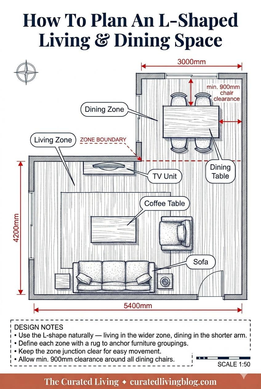
Open plan living and dining spaces are the hardest to get right — and the most rewarding when they work. The biggest mistake? Treating the entire space as one big room and furnishing it as such.
The architect's approach is to zone first. Before any furniture is chosen, define where the living zone ends and the dining zone begins. This doesn't require walls or screens — it can be done entirely with furniture placement and rugs.
An L-shaped open plan is actually one of the most generous layouts to work with. The natural geometry of the room creates two distinct zones — the longer arm for living, the shorter arm for dining — without any visual separation needed. The corner becomes the natural transition point.
The golden rules for open plan zoning: Use a rug to anchor each zone. Align your furniture to a central axis where possible. Keep sightlines open — avoid tall furniture that blocks the view between zones. The zone boundary should always be at least 900mm clear on both sides.
The Home Office: Face the Room, Not the Wall

If you work from home, the position of your desk is not a minor detail — it directly affects your focus, posture, and sense of spatial wellbeing.
Most people push the desk against the wall. Face the wall, stare at nothing. Architects almost never do this. A desk should face into the room. You have a view, a sense of the space, and you're less likely to feel enclosed or mentally confined during a long workday.
The layout I recommend for most home offices: desk centred on the far wall facing the room, chair pulled 900mm away from the desk for comfortable movement, full-height bookshelf along one side wall, and — if space allows — a small reading chair on the opposite side. This last element is more important than it sounds. It gives the room a second function, makes it feel less like a cell, and creates a genuine resting space separate from the desk.
The numbers for the home office: Desk minimum 1500mm wide. 900mm clearance behind the chair. Bookshelf depth 300mm for books and décor, 400–450mm if you're storing box files.
One final insight: natural light direction matters more in a home office than any other room. Position the desk so light comes from the left for right-handed people, or the right for left-handed people — not directly in front of the screen creating glare, and not behind you casting your shadow onto your work surface.
The Rules That Apply to Every Room
900mm is your magic number. It's the minimum comfortable clearance for a human body to move through a space. Apply it to every corridor, every gap between furniture, every circulation path. If a gap is less than 900mm, it's an obstacle — not a path.
Scale before aesthetics. Before you fall in love with a sofa, measure the room and draw it to scale. A sofa that looks generous in a showroom can overwhelm a 3.5m living room. Architects always work in scale drawings first — and it's the single habit that prevents the most expensive mistakes.
Furniture doesn't define a space — space defines furniture. The room tells you what it needs. Read it: where does light come in? Where is the natural focal point? Where do people naturally enter and pause? Design around those answers, and the furniture will fall into place.
Every piece should earn its position. If you can't explain why a piece of furniture is where it is — move it. Clutter is rarely about having too much. It's about having things that haven't been given a reason to be somewhere specific.
Good spatial planning isn't a luxury skill reserved for architects. It's a way of thinking — one that, once you have it, you can apply to every room you'll ever live in.
Ready To Take It Further?
Once your layout is sorted, the next step is getting the details right — colour, kitchen planning, and everything in between. Here's what I've put together to help:
Start here — it's free: 👉 Download the Free Colour Starter Guide
Take it further: 👉 Colour Your Space Workbook — ₹199 for Indian buyers
👉 Colour & Your Home: The Complete Guide — ₹449 for Indian buyers
The essential starting point for every kitchen renovation.
The Compact Kitchen Design Guide by The Curated Living gives you that complete framework, with real market costs and a pre-execution checklist built specifically for this moment.


Comments