How To Design Your Bathroom Like An Architect
- The Curated Living
- May 7
- 6 min read

Updated: May 15

A bathroom is the smallest room in most homes. And somehow, it's also the one people get most wrong.
Not because they choose bad tiles or the wrong fixtures — but because they start with the wrong question. Most people ask: what do I want my bathroom to look like? Architects ask something different: how should this bathroom work?
That single shift in thinking — function before finish — is what separates a bathroom that feels effortless to live in from one that looks beautiful in photos but frustrates you every single morning.
I've designed bathrooms across residential projects, hotels, and corporate spaces over 11 years. And the principles that make them work are surprisingly consistent — whether the budget is modest or unlimited. Let me walk you through them.
Start With the Plan, Not the Pinterest Board
Before you choose a single tile, you need a layout. And bathroom layouts have rules — not suggestions, rules — because the distances between fixtures aren't arbitrary. They're based on how a human body actually moves and uses a space.

The three non-negotiables:
WC clearance: Minimum 700mm in front of the toilet. This is the space you need to sit down, stand up, and move comfortably. Less than 700mm and the bathroom will always feel tight — no matter how beautiful the tiles are.
Shower zone: A minimum of 900mm x 900mm for a usable shower. Anything smaller technically works but feels claustrophobic in daily use. If your bathroom allows 1000mm x 1000mm, take it — the difference is significant.
Vanity depth: 550–600mm is the standard. This gives you enough counter space to be functional without the vanity eating too much floor area.
Here's the insight that most renovation guides skip: the position of your door matters as much as the position of your fixtures. A door that swings into the toilet clearance zone, or that opens directly onto the shower screen, creates friction every single time you use the bathroom. Architects always resolve the door swing first — then plan fixtures around it.
And one more thing: locate the WC away from the entry door. Not just for privacy — though that matters — but because visually, the first thing you see when you enter a bathroom sets the tone for the entire space. A beautifully designed vanity wall is a far better first impression than a toilet.
A master bathroom is where you have enough space to make considered decisions — and enough room to get them wrong.
The elements that separate a well-designed master bathroom from a generic one are almost never the expensive fixtures. They're the details.
Wall-hung WC over floor-mounted. Always. A wall-hung toilet keeps the floor clear — visually and literally. The floor reads as continuous, the room feels larger, and cleaning is infinitely easier. The concealed cistern adds 150mm to the wall depth, but the spatial return is worth every millimetre.
Large format tiles with minimal grout lines. The fewer grout lines in a bathroom, the calmer and more expansive the space reads. A 600x1200mm tile on the floor will always look more considered than a 300x300mm grid — not because it's more expensive, but because it has fewer interruptions.
Frameless shower enclosure. A framed shower screen has a visual weight to it — the aluminium border reads as a box within a box. Frameless glass disappears. The shower zone becomes part of the room rather than a separate compartment within it.
Fixture finish consistency. Choose one metal finish and commit to it across every fixture — tapware, towel rails, toilet flush plate, shower head, cabinet handles. Mixing finishes is the fastest way to make a bathroom feel unresolved, regardless of the quality of individual pieces.
The Small Bathroom: Every Decision Counts Double
Small bathrooms are where architectural thinking earns its keep. Because in a tight space, every decision has a consequence — there's no room to absorb a bad one.
The principles I apply to every compact bathroom:
Go vertical. Small bathrooms lose space horizontally — so gain it vertically. Floor-to-ceiling tiles draw the eye upward and make the ceiling feel higher. Full-height storage rather than under-vanity cabinets. A tall, slim mirror rather than a wide, low one.
Fixed glass panel over full enclosure. A shower enclosure with a door adds visual weight and takes up swing clearance. A single fixed glass panel defines the wet zone without enclosing it — the space reads as one continuous room rather than two compartments.
Recessed everything. A recessed medicine cabinet above the vanity gives you storage without projection — the wall stays flat, the room stays calm. Recessed shelving niches in the shower wall eliminate the need for a separate shelf or caddy. Every millimetre of projection you remove makes the room feel larger.
Wall-hung fixtures only. In a small bathroom, floor-mounted fixtures — WC, vanity — create visual clutter at floor level. Wall-hung alternatives keep the floor clear and visible, which is the single most effective way to make a small bathroom feel larger than it is.
Here's the insight worth remembering: a small bathroom doesn't need to feel small. It needs to feel uncluttered. Those are two very different problems — and only one of them requires more space to solve.
The Vanity Wall: The Most Underdesigned Element in Most Bathrooms
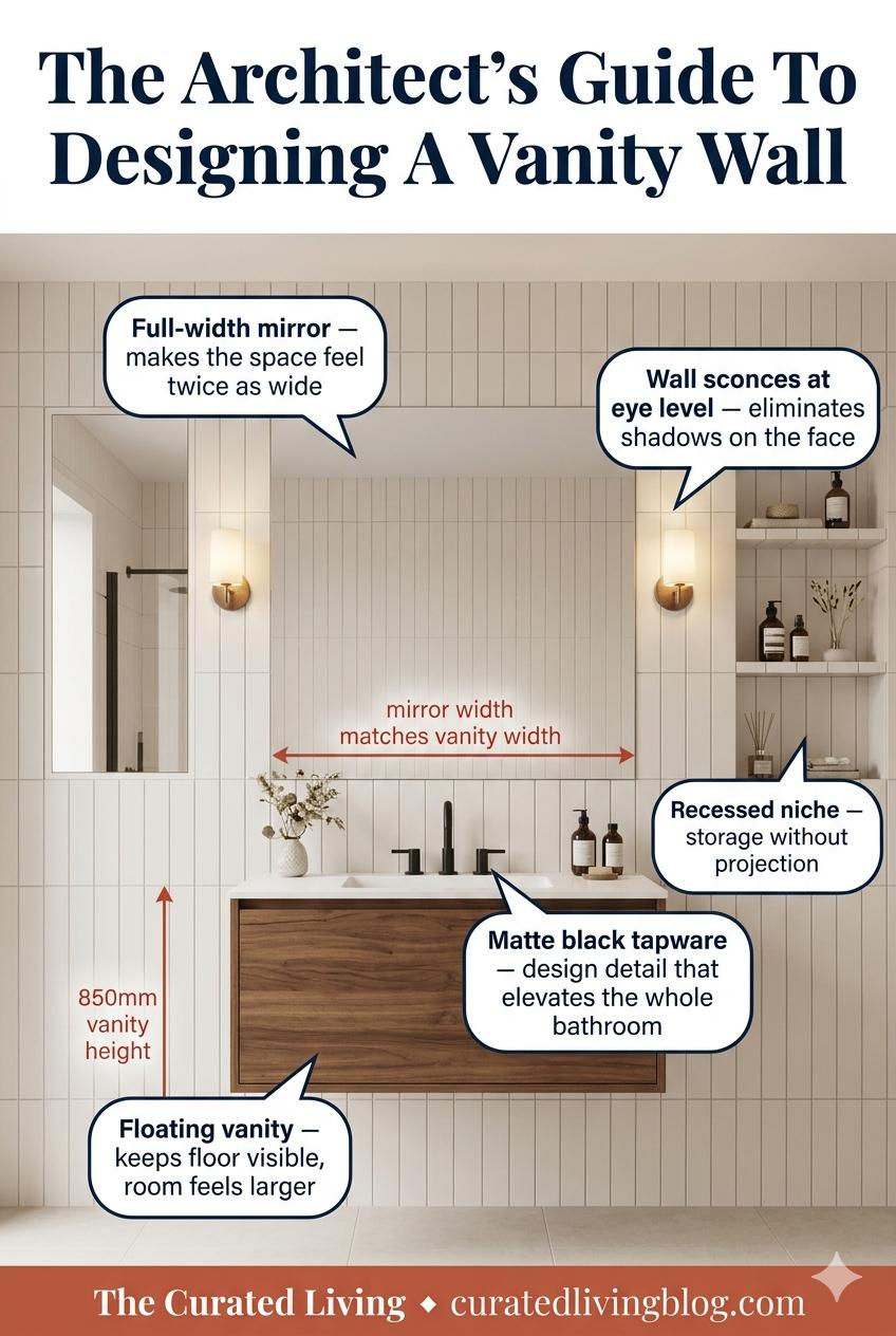
Most bathrooms have a vanity. Very few have a vanity wall — a considered, composed elevation that works as a unified design statement rather than a collection of separate elements.
Here's how architects think about the vanity wall:
Mirror width should match vanity width. Not wider, not narrower. This alignment creates visual order — the mirror and vanity read as one element, not two separate things happening at the same height.
Light the face, not the mirror. Recessed downlights above a mirror create shadows on the face — the worst possible light for a bathroom. Wall sconces positioned at eye level on either side of the mirror eliminate shadows entirely. It's the same logic used in dressing rooms and hotel suites — and it works.
The vanity height is 850mm. Not 720mm like a kitchen counter, not 900mm like a bar. 850mm is the ergonomic standard for a bathroom vanity — high enough to use comfortably without bending, low enough to see clearly into a mirror at standard height.
Floating vanity, always. A floor-mounted vanity cuts the room in half visually — the eye stops at the cabinet base and the floor disappears. A floating vanity lets the floor continue beneath it, making the room read as larger and the vanity as lighter.
The Luxury Bathroom: It's About Restraint, Not Excess

The most common misconception about luxury bathrooms is that they require more — more features, more finishes, more fixtures. The truth is almost the opposite.
The most beautiful bathrooms I've ever designed — and the most beautiful ones I've ever seen — are defined by what's been left out.
A freestanding bathtub works as a focal point precisely because everything around it is calm. One feature wall in dramatic marble. One floor finish. One metal finish throughout. A single pendant above the tub instead of a grid of downlights. The restraint is the luxury.
Position the freestanding tub against a feature wall. Not in the centre of the room — that's a showroom, not a home. Against a wall, with a clear view from the entry, the tub becomes a considered focal point rather than a piece of furniture looking for a reason to be somewhere.
Minimum 600mm clearance around a freestanding tub. On all sides. This isn't just about access — it's about the visual breathing room the tub needs to read as a statement piece. Squeeze it into a corner and it loses its effect entirely.
Floor-mounted filler tap over wall-mounted. In a luxury bathroom, a floor-mounted tap beside the tub is a design choice that signals intention. It requires no wall penetration, no tiling around a spout, and it looks exactly like what it is — something chosen deliberately.
The Rule That Ties All of It Together
Every bathroom decision — layout, fixtures, finishes, lighting — should serve one goal: making the space feel effortless to use and calm to be in.
Not impressive. Not dramatic. Calm.
Because you use your bathroom twice a day, every day of your life. The rooms that age best — that you never tire of — are the ones that don't try too hard. Clean lines, considered proportions, consistent finishes. The architecture disappears, and what's left is just a space that feels right.
That's what good bathroom design actually is.
Ready To Take It Further?
Good spatial decisions don't stop at the bathroom door. If you're planning or refreshing other rooms in your home, here's what I've put together to help:
Start here — it's free: 👉 Download the Free Colour Starter Guide
Take it further: 👉 Colour Your Space Workbook — ₹199 for Indian buyers
👉 Colour & Your Home: The Complete Guide — ₹449 for Indian buyers
The essential starting point for every kitchen renovation.
The Compact Kitchen Design Guide by The Curated Living gives you that complete framework, with real market costs and a pre-execution checklist built specifically for this moment.


Comments