Colours for Small Rooms: What an Architect Recommends
- The Curated Living
- May 2
- 4 min read

Updated: May 15

If you walk into a small room and it feels dark, heavy, or suffocating, the problem is almost never the size. It's the colour.
After eleven years of designing spaces — from compact urban apartments to carefully planned residential interiors — I can tell you this with certainty: colour is the single most powerful tool you have in a small room. Used well, it can make a 10×10 room feel like it breathes. Used poorly, it can make a generous space feel like a box.
Here is exactly what I recommend.
Why Colour Affects Perceived Space
Your eye processes colour before it processes dimension. This means that before your brain registers how large a room is, it has already responded to its colour temperature, value, and saturation.
Light colours reflect more light, pushing walls visually outward. Dark colours absorb light, drawing walls inward. Warm colours advance — they feel closer. Cool colours recede — they feel further away.
This is not opinion. It is how human vision works. And as an architect, it is something I use deliberately in every project.
The Colours That Actually Work in Small Rooms
Soft whites and off-whites are the most reliable choice. But not all whites are equal. A cool, blue-toned white in a north-facing room will feel clinical and stark. Choose whites with a warm undertone — ivory, linen, or cream — and the room will feel both larger and more inviting.
Sage green is one of my most-recommended colours for small living rooms and bedrooms. It has enough depth to feel intentional, but its muted, grey-green undertone keeps it from overwhelming a compact space. It also works beautifully with natural wood and warm textiles.
Soft dusty blue works exceptionally well in small bedrooms. It is a receding colour — it visually pushes the walls back — and its calming quality makes it ideal for rest spaces. Pair it with white ceilings and warm wood furniture for balance.
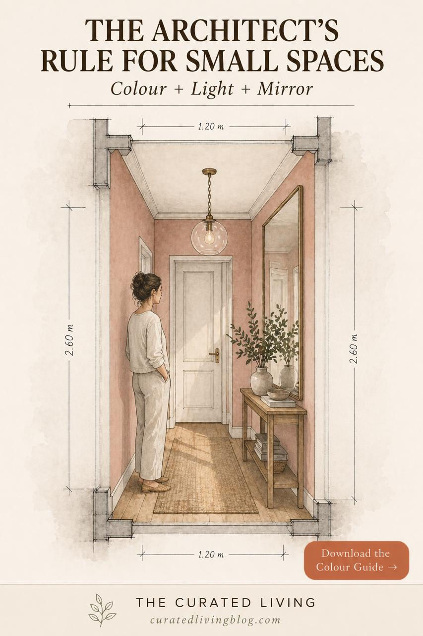
Warm blush and terracotta tones work well in narrow corridors and entryways. These spaces are transitional — you pass through them rather than inhabit them — so a slightly warmer, more enveloping colour actually works in your favour here.

The Architect's Rules for Colour in Small Spaces
Rule 1: Always paint the ceiling lighter than the walls. A white or near-white ceiling reads as sky. It lifts the room visually even when the walls are coloured. The moment you darken a ceiling, the room feels lower and smaller.
Rule 2: Use one colour, not many. In a small room, every colour transition is a visual stop. Each stop makes the eye register a boundary — and boundaries make spaces feel smaller. One consistent wall colour with white trim and ceiling creates flow and perceived depth.
Rule 3: Colour + light + mirror. No colour works in isolation. If your small room lacks natural light, the best wall colour in the world will not save it. Address light first — maximise window openings, use sheer curtains, add a well-placed mirror to bounce light — then choose your colour.
Rule 4: Test before you commit. Paint a large A3 sample on your wall and live with it for three days. Observe it in morning light, afternoon light, and evening artificial light. Colour changes dramatically across the day, and what looks perfect at noon may feel entirely different at 7pm.

What Not to Do
Do not default to white simply because you are afraid of colour. A flat, uninspired white in a small room does nothing — it neither opens the space nor creates any sense of warmth or character.
Do not paint every wall a different colour. This is one of the most common mistakes I see in small homes. It fragments the space and makes it feel chaotic.
Do not ignore the undertone. Every paint colour has an undertone — green, pink, yellow, or grey. When that undertone clashes with your flooring, furniture, or lighting, the room will feel off in a way that is hard to identify but impossible to ignore.
The Simplest Formula
If you want a starting point that works in almost any small room:
Walls: soft sage green or warm off-white Ceiling: pure white or warm white Trim: warm white Textiles: natural linen, warm oak, a single botanical plant
This combination creates a space that feels calm, considered, and significantly larger than its actual dimensions.
Ready to Choose the Right Colour for Your Home?
Choosing colour for a small room is not guesswork — it is a decision that deserves the same care as any other design choice in your home.
My guide Colour & Your Home walks you through exactly how to choose wall colours for every room, how to read undertones, how to work with light, and how to build a colour palette that works across your entire home.
Start here — it's free: 👉 Download the Free Colour Starter Guide
Take it further: 👉 Colour Your Space Workbook — ₹199 for Indian buyers
👉 Colour & Your Home: The Complete Guide — ₹449 for Indian buyers


Comments