The Architect's Guide to Gallery Wall Proportions — Spacing, Scale and Technique

A gallery wall looks effortless when it works. Collected, personal, composed. And when it doesn't work — which is most of the time — it looks exactly like what it is: a collection of frames stuck to a wall without a system.
The difference between a gallery wall that stops you and one that just fills space is not the frames, the art, or the budget. It is proportion, spacing, and technique. These are the same principles architects use when designing feature walls in residential and commercial projects — and they translate directly to your home.
Here is everything you need to know before you hammer a single nail.

The One Rule That Governs Every Gallery Wall
Before you think about which frames to use or how to arrange them, there is one gallery wall proportion rule that applies to every layout style without exception.
The centre of your gallery wall arrangement should sit at 1450mm above the finished floor.
This is the same standard used in museums and galleries worldwide. It is based on average standing eye level and ensures the arrangement is viewed comfortably whether you are moving through the space or standing still. Every frame, every layout style, every wall — the centre line is always 1450mm AFF.
Most people hang their gallery walls too high. They stand in front of the wall, hold a frame up, and nail it where it feels right at standing height. The result is an arrangement that floats near the ceiling, disconnected from the furniture below and from the human beings in the room.
Mark your centre line first — measure 1450mm from the floor and draw a light pencil line across the wall. Everything you do after this point works around that line.
Frame Spacing — The Detail That Makes or Breaks the Arrangement
Once your centre line is established, the next gallery wall proportion to nail is the spacing between frames.
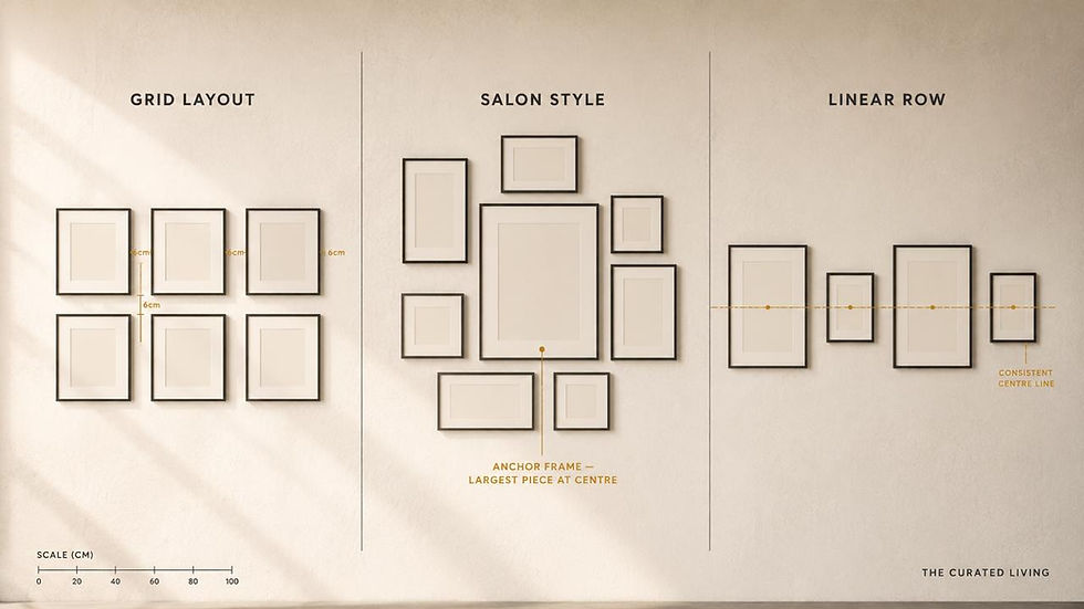
The rule: maintain 5 to 8cm of space between every frame in your arrangement. This applies whether you are doing a tight grid, a loose salon style, or a single linear row.
Less than 5cm and the frames start to crowd each other — the arrangement loses breathing room and starts to feel cluttered rather than curated. More than 8cm and the frames begin to read as individual pieces rather than a unified arrangement. The gallery wall loses its cohesion.
The spacing should be consistent throughout. One of the most common gallery wall mistakes is careful spacing in the centre of the arrangement that gradually drifts as you work outward. Measure every gap. It takes longer but the result is immediately visible.

The Three Layout Styles — and How to Choose
There are three primary gallery wall layout approaches, each with different proportional logic.
The Grid is the most structured approach — equal sized frames in even rows and columns with perfectly consistent spacing. It works best in formal spaces and with a single consistent subject matter — a series of botanical prints, a set of black and white photographs, a collection of architectural drawings. The grid demands precision. Every frame the same size, every gap identical. Any deviation reads as a mistake rather than a choice.
Salon Style is the most flexible and the most forgiving — a layered cluster of mixed frame sizes arranged asymmetrically around a central anchor piece. The anchor is the largest frame in the arrangement and it should be hung first, centred on your 1450mm line. Everything else builds outward from it. Salon style works because the variation in frame size creates visual rhythm — your eye travels across the arrangement rather than landing in one place and stopping.
The Linear Row is the most minimal approach — a single horizontal line of frames hung at a consistent centre line. It works particularly well in narrow spaces, corridors, and above low furniture like a sideboard or bed. The key to a successful linear row is variation in frame size — alternating large and small keeps the row from feeling monotonous.
How to Anchor a Gallery Wall to Furniture
One of the most important gallery wall proportions is the relationship between the bottom of the arrangement and the furniture below it.
A gallery wall that floats in the middle of a wall with no furniture reference looks unfinished. A gallery wall anchored to a piece of furniture — a console table, a sideboard, a sofa — feels intentional and grounded.
The rule: the bottom of your gallery wall arrangement should sit 25 to 30cm above the top of the furniture piece below it. Close enough to create a clear visual connection, far enough to allow the furniture to breathe.
If there is no furniture on the wall, the bottom of the arrangement should sit no lower than 120cm from the floor — this prevents the arrangement from feeling like it is sinking toward the ground.
The Paper Template Method — How to Plan Before You Nail
This is the technique architects use on site and the single most useful thing you can do before hanging a single frame.
Cut kraft paper or newspaper to the exact size of each frame in your arrangement. Label each cutout with the frame dimensions. Pin or tape these paper templates to the wall in your planned arrangement. Step back. Live with it for a day. Adjust.
The paper template method lets you see the actual scale of your arrangement on the wall before committing to nail holes. It reveals proportion problems that are impossible to see when you are just looking at frames on the floor. A group of frames that looked balanced laid out horizontally will often reveal gaps, imbalances, or scale issues the moment they go vertical on a wall.
Start with your anchor frame template at the centre line. Work outward in both directions. Check your 5-8cm spacing with a ruler. Only when you are completely satisfied with the paper arrangement should you begin hanging.

The Proportions Checklist
Before you hang your gallery wall, confirm these five things:
Centre line marked at 1450mm AFF. Anchor frame identified and centred on the line. Frame spacing consistent at 5-8cm throughout. Bottom of arrangement 25-30cm above furniture below. Overall arrangement width proportional to the wall — aim for the arrangement to cover between 2/3 and 3/4 of the wall width.
If all five are confirmed, your gallery wall will work. Not because it looks a certain way, but because the underlying proportions are sound.
The same spatial logic that makes a gallery wall work applies to every surface, every room, every arrangement in your home. If that way of thinking about space resonates with you, there is something I have been working on that goes much deeper into these principles. Subscribe below to be the first to know.
In the meantime, the Colour & Your Home guide covers how colour decisions interact with wall compositions and spatial proportion. And the Compact Kitchen Design Guide applies the same architect's logic to your most used room. Both are linked below.
Start with the free guides — no commitment, just good design thinking straight to you.
Start here — it's free: 👉 Download the Free Colour Starter Guide
Take it further: 👉 Colour Your Space Workbook — ₹199 for Indian buyers
👉 Colour & Your Home: The Complete Guide — ₹449 for Indian buyers
The essential starting point for every kitchen renovation.
The Compact Kitchen Design Guide by The Curated Living gives you that complete framework, with real market costs and a pre-execution checklist built specifically for this moment.


Comments