The 5 Living Room Scale Mistakes Architects Spot in Every Home
- The Curated Living
- Jun 15
- 5 min read

You've styled the room. The colours work. The furniture is good quality. And yet something feels slightly off — not wrong enough to name, just not quite right.
Nine times out of ten, the problem is scale.
Scale is the relationship between the size of your furniture and the size of your room. When those relationships are off — even slightly — the room reads as unsettled, unresolved, incomplete. And here's the thing about living room scale mistakes: they're invisible until you know what to look for. Once you see them, you cannot unsee them.
After 12 years of designing spaces professionally, these are the five living room scale mistakes I spot in almost every home — and exactly how to fix each one.

Mistake 1 — The Sofa Is Too Small for the Wall
This is the most common living room scale mistake and the one that has the biggest impact on how a room feels.
Most people choose a sofa based on how it looks in the showroom or whether it fits through the door. Almost nobody measures the wall it will sit against — and that is the measurement that actually matters.
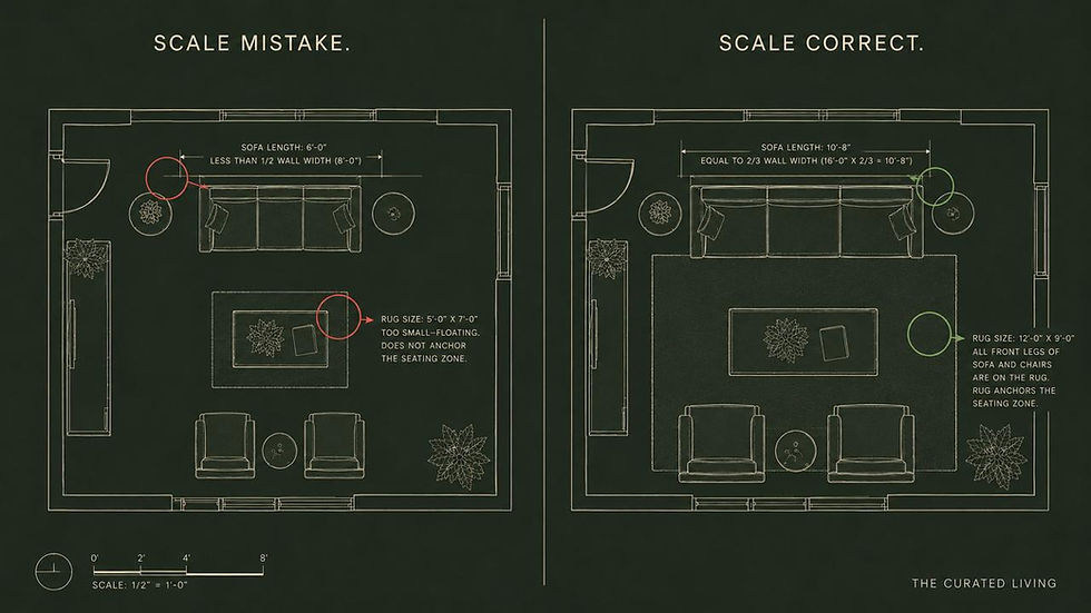
The rule architects use: your sofa should be between 2/3 and 3/4 of the width of the wall it's placed on. A sofa that is shorter than half the wall width will float — it will look lost, undersized, and the room will feel unanchored on that side.
If your wall is 4 metres wide, your sofa should be between 2.6 and 3 metres long. If your wall is 3 metres wide, you need a sofa of at least 2 metres.
The fix is not always buying a new sofa. Sometimes it's flanking the sofa with side tables or floor lamps to visually extend its presence on the wall. But if the sofa is genuinely too small, no amount of accessorising compensates for the proportion gap.
Mistake 3 — The Art Is Hung Too High
Walk into almost any home and the artwork will be hung too high. This is one of those living room scale mistakes that is so universal it has become the default — people hang art at whatever height feels natural when they're standing up, which is almost always too high.
The standard that architects and museum curators use: the centre of the artwork should sit at approximately 145cm from the finished floor. This is based on average eye level and ensures the art is viewed comfortably whether you are standing or seated.
When art is hung too high, it disconnects from the furniture below it. The sofa and the artwork become two separate elements floating in the room rather than one composed arrangement. The wall reads as fragmented.
The fix is simple: measure 145cm from the floor, mark it lightly with a pencil, and hang your art so its centre lands on that mark. If you have a large piece, it will likely feel lower than you expect. That discomfort is your eye adjusting to the correct proportion.
Mistake 4 — The Floor Lamp Is Too Short
Floor lamps are one of the most underestimated elements in a living room — and one of the most commonly scaled incorrectly.
The purpose of a floor lamp is to bring light down to human scale. The shade of a floor lamp should sit at approximately eye level when you are seated — roughly 150cm from the floor. When the lamp is shorter than this, the light source drops below eye level and the lamp loses its visual presence in the room. It reads as a table lamp that ended up on the floor by mistake.
A floor lamp that is correctly scaled — tall, with the shade at eye level — anchors a corner, creates a layered lighting moment, and adds vertical presence that balances horizontal furniture.

Mistake 5 — The Coffee Table Is the Wrong Proportion
The coffee table proportion rule is one of the clearest in residential design and one of the most consistently ignored in furniture shopping.
Your coffee table should be between 1/2 and 2/3 the length of your sofa. A coffee table shorter than half the sofa length will look toy-sized and get visually swallowed by the larger piece. A coffee table wider than 2/3 the sofa starts to crowd the space and obstruct circulation.
The second dimension to check is the clearance between your sofa and the coffee table. The ideal gap is 40 to 50cm — enough to reach the table comfortably from the sofa without having to lean, and enough to walk past without turning sideways.
If your sofa is 220cm long, your coffee table should be between 110cm and 145cm in length. Most standard coffee tables fall well below this range — which is why they so often look undersized in the finished room.

Why Scale Matters More Than Style
These five living room scale mistakes share something in common — none of them are about taste, budget, or style. They are about spatial relationships. And spatial relationships operate underneath style. You can have the most beautiful furniture in the world arranged at the wrong scale and the room will never feel resolved.
The good news is that most of these fixes cost nothing. Rehang your art. Move your rug forward. Measure before you buy your next piece. These are adjustments, not renovations.
Scale is the thing most interior content skips because it requires measuring rather than shopping. But it is the single highest-impact change you can make to a room that isn't working — and once you understand it, every space you walk into will start to make more sense.
If this way of thinking about space resonates with you — the idea that there are rules underneath the room that determine how it feels — there is something I have been working on that goes much deeper. Subscribe below to be the first to know.
Start with the free guides — no commitment, just good design thinking straight to you.
Start here — it's free: 👉 Download the Free Colour Starter Guide
Take it further: 👉 Colour Your Space Workbook — ₹199 for Indian buyers
👉 Colour & Your Home: The Complete Guide — ₹449 for Indian buyers
The essential starting point for every kitchen renovation.
The Compact Kitchen Design Guide by The Curated Living gives you that complete framework, with real market costs and a pre-execution checklist built specifically for this moment.


Comments